The EMs have it: Proportional Media Queries FTW!

Hay, I wrote this in 2012!
I still like the notion of the metaphorical connection between content-based sizing units (e.g. ems) and layout definitions (e.g. breakpoints). And the zooming behavior cited here was always meant more as a sidelong example than a core argument. Nonetheless! You should note that the zooming behavior has long since been made consistent in browsers (i.e. fixed). Keep that in mind if you cite or otherwise put stock in this post. I never meant to be absolutely prescriptive about ems as units—use whatever feels natural and appropriate for your design strategy. And thanks for reading!
–Lyza, March 11, 2015
If we’re going to be proportional…
A core tenet of Responsive Web Design (RWD) is fluidity and proportion. Instead of using fixed-width layouts, we enlightened web devs and designers use percentages in our CSS. Font units aren’t pixels or points anymore, they’re percentages (typically for top-level baseline reset) or, more often, ems. And yet the vast majority of us still write width-based media queries in pixels, e.g.:
@media all and (min-width: 500px) {} @media screen and (max-width: 800px) {}It’s a natural thought process: for windows or screens of particular width ranges, we want to flow our content in a particular way. This naturally seems like a pixel dimension. But, once again, to bring out my big hammer, what about when we look at things from a content perspective?
Folks who design for traditional reading media—where the content really is king—don’t center design decisions around the absolute width of content-holding elements so much as around the optimal line lengths for the content they’re flowing. There are some tried-and-true numbers one can shoot for that make for the “right” number of letters (and thus words) per line for comfortable human reading.
Thus actual column width is a function of font size and ems-per-line.
Baseline expectations
You may have seen the rule of thumb (useful, admittedly!) that makes the following general equation in terms of baseline font sizes in CSS:
100% = 1 em ~= 16px ~= 14ptThis means that, at your baseline, that is, before you’ve adjust font sizes in any child elements, the default font size in the browser is usually approximately 16px and usually approximately 14pt but always 100% and 1em.
If we start from a baseline of 16px, you may well wonder what the difference (beyond academic) is between a media query like:
@media all and (min-width: 400px)and one like this, that uses ems multiplied against the 16px baseline approximation:
@media all and (min-width: 25em)The answer, my friend, is content
Here’s the 64-dollar question or whatever:
What happens when the baseline is not 14pt/16px?
On Ye Olde Desktop Web, this situation most often comes about (“most often” is unscientific here, but I’m willing to toss out the hypothesis, at least) from user-intiated zoom in browsers. Low-sight users might do it, I know I do it when I’m surfing the web on my Mac Mini from the couch across the room. I’m not that old but, man, it’s hard to see the contents of a Wikipedia article on a 23″ monitor from 10 feet away.
As I zoom in, that is, make the text larger in my browser, I’m no longer at a 14pt/16px baseline. 100%/1em in my world is now a different number, maybe 18pt, maybe 32px. Pixel-defined content holders no longer have comfortable amounts of words per line. Pixel-defined content holders that float might wrap awkwardly as the content in them swells.
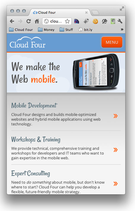
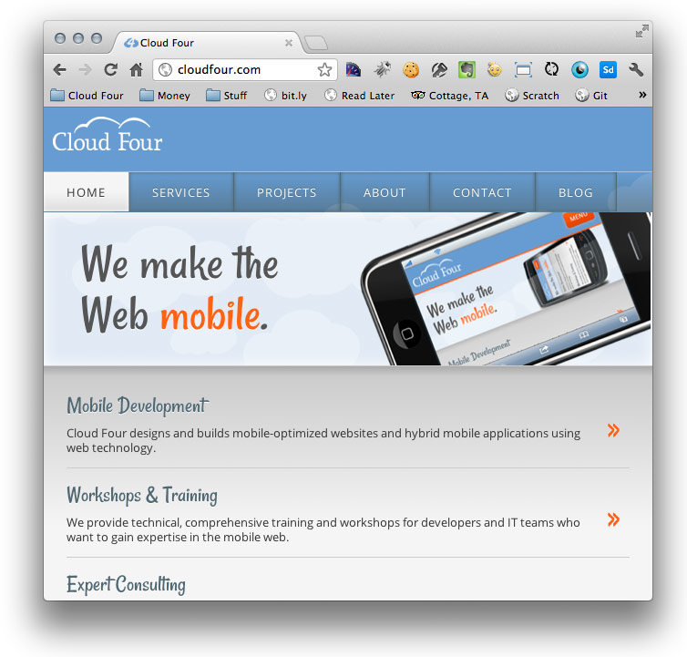
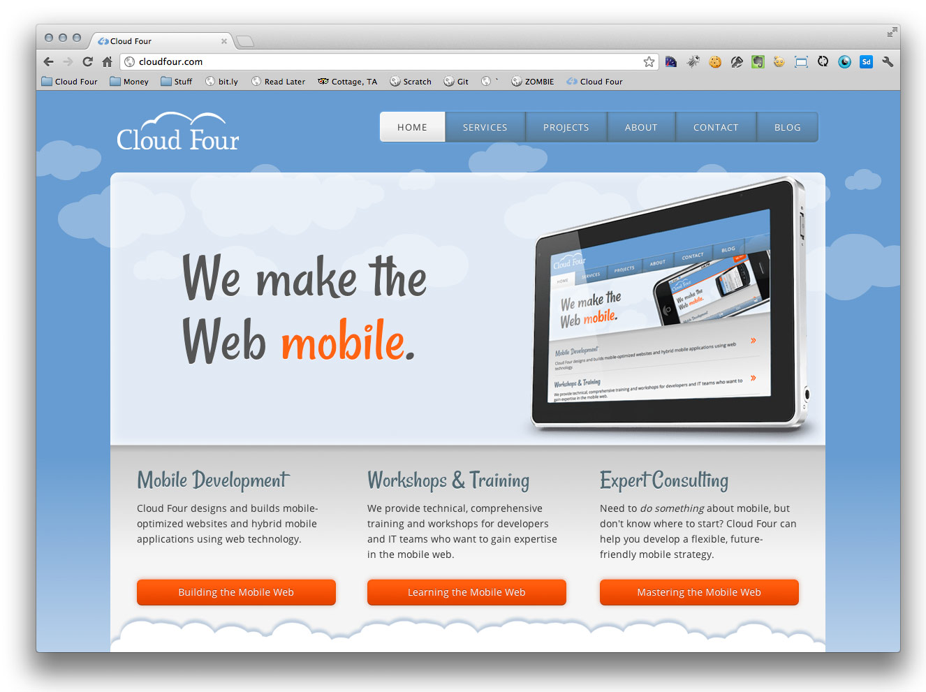
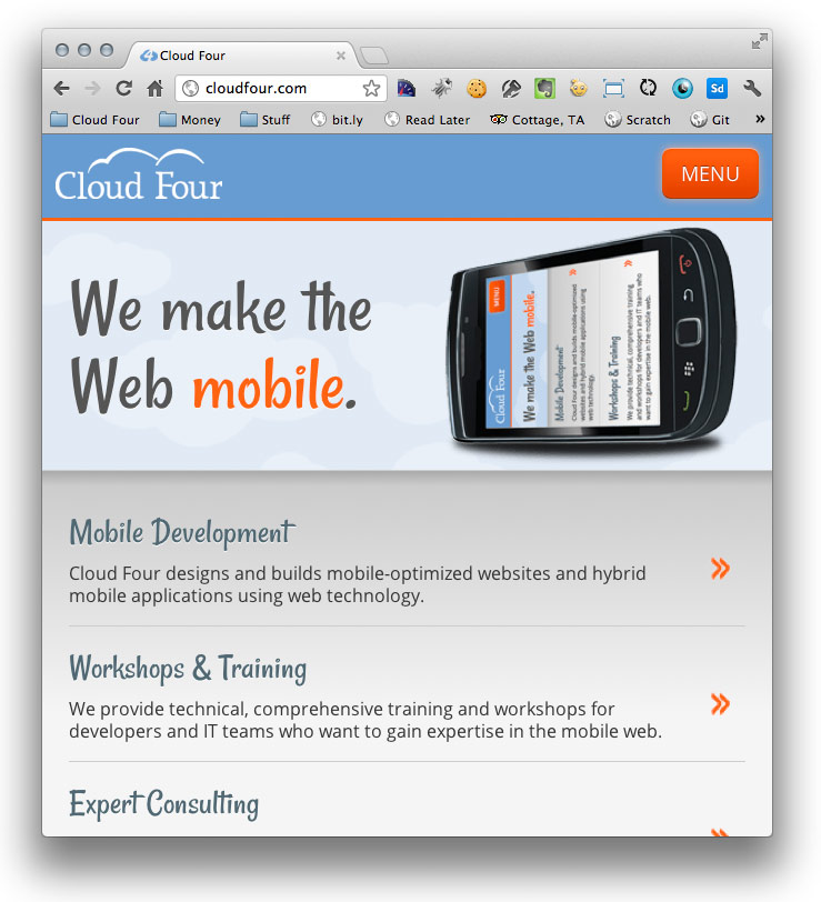
Case study: Our nav
Our creative director and CSS wizard extraordinaire, Aileen, whipped us up a beaut of a responsive new site layout. For various screen widths, our site’s nav has a few different behaviors.
In pixels at normal zoom, the nav elements fit in a line roughly at a width of around 656px. There’s generous room to detatch and float next to the logo at around 960px.
But what happens if a user has his or her zoom set higher?
I’ll show you a little experiment. I’m using the Chrome browser, and I’m viewing our site with a window about 670 pixels wide. With a pixel-based media query, that puts me in the second category of nav experience: all of the top level items are shown horizontally, docked to the top of the content:
Zoom In command twice to make my text larger.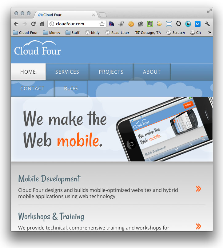
Why did this happen?
The pixel-based media query @media all and (min-width:656px) still evaluates to true with the zoomed-in text and therefore creates awkwardly-wrapped nav elements.
However, the em-based media query of @media all and (min-width: 41em) scales to the larger text size. Zoomed in like this, the browser no longer satisfies that query: we have fewer than 41ems to work with. So we deliver the menu-button nav pattern and other layout and styling appropriate for the way the text fits. Content, again, is what ends up dictating what we’re doing in the end.
You could also make the text smaller and watch the same proportional adjustments occur, in the inverse.
BTW: It should be noted that, unlike window resizes, which cause media queries to be re-evaluated immediately, you’ll need to reload the current page if you zoom in or out for em-based media queries to re-apply. My hunch is that most users who zoom a lot keep their zoom set as they navigate around different pages and aren’t changing zoom settings on a site-by-site basis. I could be wrong about that, though.
The specifics of em-based media queries
The media queries on our site are all crafted based on the approximate baseline. We played with our browser window widths, adjusting them until it looked like they were at the appropriate width to create a breakpoint at normal text zoom. We noted that pixel measurement and divided it by the rough baseline of 16px to arrive at our em units. There may well be a better way to do this math, but this seems to do the trick so far.
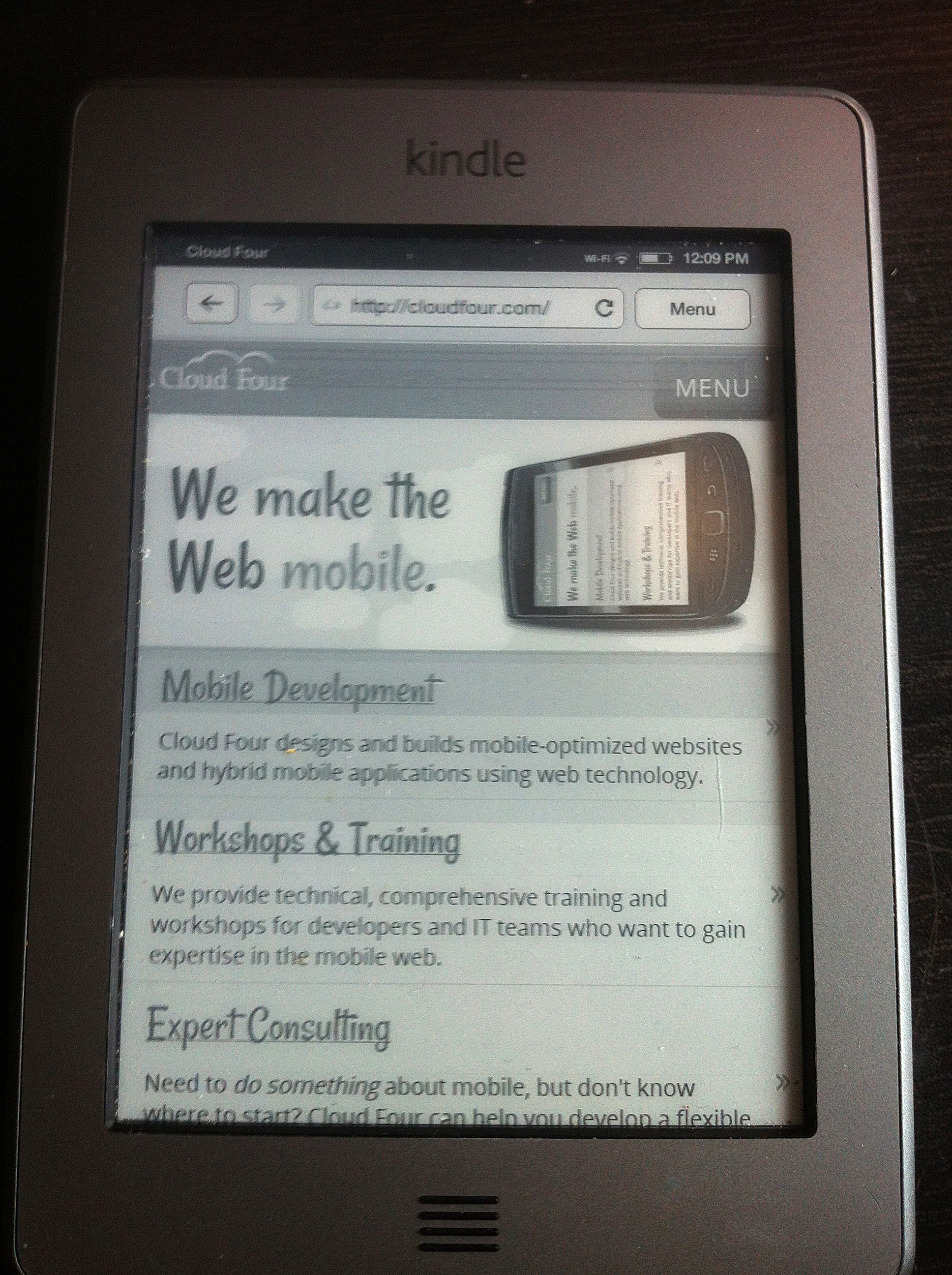
A device-specific aside
One of the things that spurred me toward thinking about em-based media queries was my own Kindle Touch. Through no action of my own, the Kindle browser’s default text zoom is, roughly put, high. Like newer smartphones, the Kindle has a high pixel density, 167ppi. An absolute-sized font (say, 16px) on a high-density screen is correspondingly tiny. Most smartphone browsers get around this by reporting their resolution differently for purposes of the web. An iPhone 4, for example, which has a real resolution of 640×960 and 326ppi, masquerades as 320×480 in the browser as a way to get normally-designed websites to look normally-sized and not teeny tiny. For the iPhone, 1em is still approximately 16px or 14pt, and so pixel-based media queries generally behave equivalently to em-based ones (disclaimer: that’s a broad generalization).
The Kindle Touch, on the other hand, has taken a different approach. It reports its web pixel resolution as 600×800, but its default text size is considerably larger than 16px/14pt.
Our early, pixel-based media queries for our nav looked dreadful on the Kindle. Its resolution meant that it was using our tablet-range layout, but its text was enormous, causing widespread ugliness as the pixel-width elements didn’t scale to adjust. The site looks pretty decent, however, with media queries in ems:
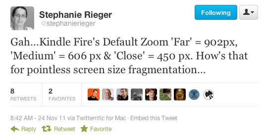
Sadly, I did find that, as reported by Stephanie and Bryan Rieger, the Kindle considers itself to be in color, so the media query @media all and (monochrome) doesn’t match it and @media all and (color) does. Too bad! Speaking of Kindle and Stephanie Rieger, the Kindle Fire tablet’s browser is also a great cautionary tale about mistaken complacence about “standard” device screen widths like 480, here is an enlightening tweet:
p.s. Thanks to the observant folks in the community who have noticed that our nav, at wider widths, has drop-down elements that are not ideal in terms of usability. We‘re cooking up ideas about how to make this better! have actually made improvements to the tablet-version nav on touch devices since I started working on this post! More to come in Nav-Land.