Figure 1.1: A bland client business card
Anyone, no matter what level of artistic talent he or she has, can come up with a design that works well and looks good–all it takes is a little experience and a working knowledge of some basic layout principles. The book from which this article is excerpted, The Principles of Beautiful Web Design, covers each of these principles in turn, showing even the least design-oriented of us how to create beautiful, elegant, functional designs — see the Table of Contents for details. You can download this article — Chapter 1 of the book — in PDF format to read offline. So let’s get started with the basics and before long you’ll have the foundation necessary to design gallery-quality web sites.
The Design Process
In a web programming book I read recently, the author introduced a fictional scenario to explain why readers needed to design a page layout and create a style sheet for the example application. He basically said that the company web designer was off getting inspiration from somewhere and wouldn’t be back until later in the year. It sounded as if he was implying that designers are prone to flake out and go on vision quests for months at a time, but I’m going to assume the author made that comment in an endearing way, and introduce the same scenario. Here are the hypothetical details of this scenario: Jim Smith of Smith Services needs a web site. We have his business card and he’s eager to get started. Unfortunately, the designer is out of town … wait, that’s not a good excuse. Let’s say he was injured during a freak dairy cow stampede while attending the South by South West Interactive (SXSWi) festival in Austin, Texas. Yeah, that’s believable. Anyway, he’s out for a few months, and you’re on your own. So where do you start? The actual process of developing an entire site or web application includes a lot of steps, but the process of creating a design comp boils down to only two tasks: discovery and implementation. Discovery The discovery component of the design process is about meeting the clients and discovering what they do. This may not feel like a “designy: task, but gathering information about who your clients are and how they run their business is the only way you’ll be able to come up with an appropriate and effective design. Before you schedule your first meeting with your clients, take a few minutes to figure out what they do and how they do it. If they’ve asked you to design a web site for them, they may not currently have one, but Google them anyway. If you can’t find any information about their business specifically, try to learn a little more about their industry before the first meeting. Whenever possible, the first meeting with a client should be an actual person-to-person meeting. Sometimes, distance will dictate that the initial meeting will occur over the phone, but if the client is in town, schedule a time to meet. Keep in mind that this meeting isn’t about impressing the client, selling yourself, or selling a web site. The initial client meeting is about communication. Try to listen more than you speak, and bring a pad of paper on which you can make notes. Do not bring a laptop. Computers have screens, and people tend to stare at them. If the client isn’t staring at the screen the whole time, you will be as you write your notes. If you must drag some technology into the meeting, bring a voice recorder. In my experience, though, a pad of paper is less threatening to the often not-so-tech-savvy client. Here are a few of the questions I like to ask in initial client meetings even if I’ve already answered them myself via a search engine:- What does the company do?
- What is your role in the company?
- Does the company have an existing logo or brand?
- What is your goal in developing a web site?
- What information do you wish to provide online?
- Who comprises your target audience? Do its members share any common demographics, like age, sex, or a physical location?
- Who are your competitors and do they have web sites?
Defining Good Design
There are two main standpoints from which most people determine whether a web site design is “good” or “bad.” There’s a strict usability standpoint, which focuses on functionality, the effective presentation of information, and efficiency. Then there’s the purely aesthetic perspective, which is all about presentation, hot animations, and sexy graphics. Some designers get caught up in the aesthetics and graphics and forget about the user, and some usability gurus get lost in their user testing and forget about visual appeal. In order to reach people and retain their interest, it’s essential to maximize both. The most important thing to keep in mind is that design is about communication. If you create a web site that works and presents information well, but looks ugly or doesn’t fit with the client’s brand, no one will want to use it. Similarly, if you make a beautiful web site that isn’t usable and accessible, people may not be able to use it. Indeed, the elements and functionality of a finished web site design should work as a single cohesive unit, so that: Users are pleased by the design but drawn to the content One of the biggest concerns among usability professionals is the time it takes users to scan the page for the information they want, be it a piece of content, a link to another page, or a form field. The design should not be a hindrance; it should act as a conduit between the user and the information. John Oxton’s Bus Full of Hippies template (pictured in Figure 1.2) is a great example of a design that’s both beautiful and usable. The colorful graphics grow around the blocks of content, leading the eye back to the information without interfering with the pages’ readability or organization. Figure 1.2: The Bus Full of Hippies template
Users can move about easily via intuitive navigation
We’ll talk more about the placement of navigation later, but the main navigation block itself should be clearly visible on the page, and each link should have a descriptive title. A navigation structure that not only changes appearance on mouse hover, but also indicates the active page or section, as does the menu shown in Figure 1.3, helps users recognize where they are, and how to get where they want to go.
Figure 1.2: The Bus Full of Hippies template
Users can move about easily via intuitive navigation
We’ll talk more about the placement of navigation later, but the main navigation block itself should be clearly visible on the page, and each link should have a descriptive title. A navigation structure that not only changes appearance on mouse hover, but also indicates the active page or section, as does the menu shown in Figure 1.3, helps users recognize where they are, and how to get where they want to go.
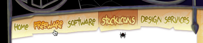 Figure 1.3: A navigation menu from Iconfactory‘s Halloween 2006 theme
Secondary navigation, search fields, and outgoing links should not be dominant features of the page. If we make these items easy to find, and separate them visually from the content, we allow users to focus on the information, though they’ll know where to look when they’re ready to move on to other content.
Users recognize each page as belonging to the site
Even if there’s a dramatic difference between the layout of the homepage and the rest of the site, a cohesive theme or style should exist across all the pages of a site to help hold the design together.
Take a look at the screenshots of Steve Smith’s Ordered List in Figure 1.4. Although the content blocks on these pages are divided differently, there are several visual indicators that let users know that these are pages from the same site. Much of this unity is due to the repetition of the identity and navigation blocks. The consistent use of a very limited color palette (black, white, green, and cyan) also helps to unify the pages.
Figure 1.3: A navigation menu from Iconfactory‘s Halloween 2006 theme
Secondary navigation, search fields, and outgoing links should not be dominant features of the page. If we make these items easy to find, and separate them visually from the content, we allow users to focus on the information, though they’ll know where to look when they’re ready to move on to other content.
Users recognize each page as belonging to the site
Even if there’s a dramatic difference between the layout of the homepage and the rest of the site, a cohesive theme or style should exist across all the pages of a site to help hold the design together.
Take a look at the screenshots of Steve Smith’s Ordered List in Figure 1.4. Although the content blocks on these pages are divided differently, there are several visual indicators that let users know that these are pages from the same site. Much of this unity is due to the repetition of the identity and navigation blocks. The consistent use of a very limited color palette (black, white, green, and cyan) also helps to unify the pages.
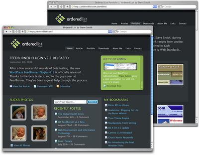 Figure 1.4: Pages from Ordered List
Web Page Anatomy
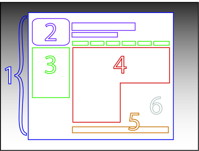 Figure 1.5: The anatomy of a web page
Even from a non-designer’s standpoint, defining a design that satisfies all of the requirements I outlined above is a simple task. It’s similar to making a phrase on your refrigerator with magnetic poetry words. Although there are millions of ways to arrange the words, only a few arrangements make any sense. The magnetic poetry words are like the components, or blocks, of the web page. Although the number of these necessary blocks depends on the size and subject of the site, most web sites have the following components, as shown in Figure 1.5.
Containing Block
Every web page has a container. This could be in the form of the page’s body tag, an all-containing div tag, or (and I really don’t want to say this, but) a table. Without some sort of container, we would have no place to put the contents of our page. The elements would drift beyond the bounds of our browser window and off into empty space. The width of the container can be liquid, meaning it expands to fill the width of the browser window; or fixed, so that the content is the same width no matter what size the window is.
Logo
When designers refer to an identity, they’re referring to the logo and colors that exist across a company’s various forms of marketing, such as business cards, letterhead, brochures, and so on.
The identity block that appears on the web site should contain the company’s logo or name, and sit at the top of each page of the web site. The identity block increases brand recognition and lets users know that the pages they’re viewing are part of a single site.
Navigation
It’s essential that the site’s navigation system is easy to find and use. Users expect to see navigation right at the top of the page. Whether you plan to use vertical menus down the side of the page, or a horizontal menu along the page’s top, the navigation should be as close to the top of the layout as possible. At the very least, all main navigation items should appear “above the fold.”
Content
Content is king. A typical web site visitor will enter and leave a web site in a matter of seconds. If visitors can’t find what they’re looking for, they will undoubtedly close the browser or move on to another site. It’s important to keep the main content block as the focal point of a design so that precious seconds aren’t wasted as visitors scan the page for the information they need.
Footer
Located at the bottom of the page, the footer usually contains copyright, contact, and legal information, as well as a few links to the main sections of the site.
By separating the end content from the bottom of the browser window, the footer should indicate to users that they’re at the bottom of the page.
Whitespace
The graphic design term whitespace (or negative space) literally refers to any area of a page that’s not covered by type or illustrations. While many novice web designers (and most clients) feel a need to fill every inch of a web page with photos, text, tables, and data, having empty space on a page is every bit as important as having content. Without carefully planned whitespace, a design will feel closed in, like a crowded room. Whitespace helps a design to “breathe” by guiding the user’s eye around a page, but also helps to create balance and unity–two important concepts that we’ll discuss in more detail later in this chapter.
At this point, we’ve had our initial meeting with Mr. Smith, our theoretical client, and it was very helpful. He explained very thoroughly what he does and what he wants the site to achieve. Even though we don’t have actual content yet, we can use the standard blocks of web page anatomy to start developing a layout. Although other site-specific blocks are worked into the designs of many web site layouts, the web page anatomy works to summarize the most common blocks.
Now that we have this information, how can we use it to create a foundational layout for Smith’s Services? It’s time for some grid theory.
Figure 1.5: The anatomy of a web page
Even from a non-designer’s standpoint, defining a design that satisfies all of the requirements I outlined above is a simple task. It’s similar to making a phrase on your refrigerator with magnetic poetry words. Although there are millions of ways to arrange the words, only a few arrangements make any sense. The magnetic poetry words are like the components, or blocks, of the web page. Although the number of these necessary blocks depends on the size and subject of the site, most web sites have the following components, as shown in Figure 1.5.
Containing Block
Every web page has a container. This could be in the form of the page’s body tag, an all-containing div tag, or (and I really don’t want to say this, but) a table. Without some sort of container, we would have no place to put the contents of our page. The elements would drift beyond the bounds of our browser window and off into empty space. The width of the container can be liquid, meaning it expands to fill the width of the browser window; or fixed, so that the content is the same width no matter what size the window is.
Logo
When designers refer to an identity, they’re referring to the logo and colors that exist across a company’s various forms of marketing, such as business cards, letterhead, brochures, and so on.
The identity block that appears on the web site should contain the company’s logo or name, and sit at the top of each page of the web site. The identity block increases brand recognition and lets users know that the pages they’re viewing are part of a single site.
Navigation
It’s essential that the site’s navigation system is easy to find and use. Users expect to see navigation right at the top of the page. Whether you plan to use vertical menus down the side of the page, or a horizontal menu along the page’s top, the navigation should be as close to the top of the layout as possible. At the very least, all main navigation items should appear “above the fold.”
Content
Content is king. A typical web site visitor will enter and leave a web site in a matter of seconds. If visitors can’t find what they’re looking for, they will undoubtedly close the browser or move on to another site. It’s important to keep the main content block as the focal point of a design so that precious seconds aren’t wasted as visitors scan the page for the information they need.
Footer
Located at the bottom of the page, the footer usually contains copyright, contact, and legal information, as well as a few links to the main sections of the site.
By separating the end content from the bottom of the browser window, the footer should indicate to users that they’re at the bottom of the page.
Whitespace
The graphic design term whitespace (or negative space) literally refers to any area of a page that’s not covered by type or illustrations. While many novice web designers (and most clients) feel a need to fill every inch of a web page with photos, text, tables, and data, having empty space on a page is every bit as important as having content. Without carefully planned whitespace, a design will feel closed in, like a crowded room. Whitespace helps a design to “breathe” by guiding the user’s eye around a page, but also helps to create balance and unity–two important concepts that we’ll discuss in more detail later in this chapter.
At this point, we’ve had our initial meeting with Mr. Smith, our theoretical client, and it was very helpful. He explained very thoroughly what he does and what he wants the site to achieve. Even though we don’t have actual content yet, we can use the standard blocks of web page anatomy to start developing a layout. Although other site-specific blocks are worked into the designs of many web site layouts, the web page anatomy works to summarize the most common blocks.
Now that we have this information, how can we use it to create a foundational layout for Smith’s Services? It’s time for some grid theory.
Grid Theory
When most people think about grids, they think about engineering and architecture. However, the grid is an essential tool for graphic design as well. Using a grid is not just about making things be square and line up: it’s about proportion as well. That’s where the “theory” comes into grid theory. Many art historians credit Dutch painter Piet Mondrian as the father of graphic design for his sophisticated use of grids. Yet classical grid theory has influenced successful artistic efforts for thousands of years. The concept of dividing the elements of a composition extends back to the mathematical ideas established by Pythagoras and his followers, who defined numbers as ratios rather than single units. The Pythagoreans observed a mathematical pattern that occurred so often in nature that they believed it to be divinely inspired. They referred to this pattern as the golden ratio or divine proportion. The basic idea is illustrated in Figure 1.6. A line can be bisected using the golden ratio by dividing its length by 1.62. This magical 1.62 number is really 1.6180339 … It’s an irrational number that’s usually represented as Φ (pronounced phi). Explaining the math used to come up with this number is a bit too involved for this discussion, and isn’t really going to help you become a better designer, so I’ll spare you the details. Besides, my math is a little rusty.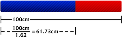 Figure 1.6: The golden ratio
So just what does this ratio have to do with graphic design? In general, compositions divided by lines that are proportionate to the golden ratio are considered to be aesthetically pleasing. The artists of the Renaissance used divine proportion to design their paintings, sculpture, and architecture, just as designers today often employ this ratio when creating page layouts, posters, and brochures. Rather than relying on artistic notion, divine proportion gives us logical guidelines for producing appealing layouts.
The Rule of Thirds
A simplified version of the golden ratio is the rule of thirds, or in the native accent of one of my graphic design professors, “rule of turds.” A line bisected by the golden ratio is divided into two sections, one of which is approximately twice the size of the other. Dividing a composition into thirds is an easy way to apply divine proportion without getting out your calculator.
To start the pencil-and-paper version of your layout, draw a rectangle. The vertical and horizontal dimensions don’t really matter, but try to keep straight lines and 90-degree angles.
Now, divide your rectangle horizontally and vertically by thirds. As I said before, don’t start thinking about technology yet.
Next, divide the top third of your layout into thirds again.
Finally, divide each of your columns in half to create a little more of a grid.
You should have a square on your paper that looks similar to the rule of thirds grid in the final diagram of Figure 1.7. Go ahead and repeat the above steps so that you have a few rule of thirds grids in which to try different layout options.
With this simple gridwork in place, we can begin to lay out our elements. The large, main rectangle represents the container that we talked about in the section called “Web Page Anatomy.” When using this method of layout design, I like to place the biggest block first. Usually, that block represents the content. In my first rule-of-thirds grid, I place the content block within the two-thirds of the layout at the lower right. Next, I place my navigation block in the middle third of the left-hand column. I place the text part of the identity block over the left side of the content, and the image part of the identity over the menu. Finally, I squash the copyright block below the content, in the right-hand column of the grid. The result is the top-left of the four possible layout arrangements shown in Figure 1.8.
Figure 1.6: The golden ratio
So just what does this ratio have to do with graphic design? In general, compositions divided by lines that are proportionate to the golden ratio are considered to be aesthetically pleasing. The artists of the Renaissance used divine proportion to design their paintings, sculpture, and architecture, just as designers today often employ this ratio when creating page layouts, posters, and brochures. Rather than relying on artistic notion, divine proportion gives us logical guidelines for producing appealing layouts.
The Rule of Thirds
A simplified version of the golden ratio is the rule of thirds, or in the native accent of one of my graphic design professors, “rule of turds.” A line bisected by the golden ratio is divided into two sections, one of which is approximately twice the size of the other. Dividing a composition into thirds is an easy way to apply divine proportion without getting out your calculator.
To start the pencil-and-paper version of your layout, draw a rectangle. The vertical and horizontal dimensions don’t really matter, but try to keep straight lines and 90-degree angles.
Now, divide your rectangle horizontally and vertically by thirds. As I said before, don’t start thinking about technology yet.
Next, divide the top third of your layout into thirds again.
Finally, divide each of your columns in half to create a little more of a grid.
You should have a square on your paper that looks similar to the rule of thirds grid in the final diagram of Figure 1.7. Go ahead and repeat the above steps so that you have a few rule of thirds grids in which to try different layout options.
With this simple gridwork in place, we can begin to lay out our elements. The large, main rectangle represents the container that we talked about in the section called “Web Page Anatomy.” When using this method of layout design, I like to place the biggest block first. Usually, that block represents the content. In my first rule-of-thirds grid, I place the content block within the two-thirds of the layout at the lower right. Next, I place my navigation block in the middle third of the left-hand column. I place the text part of the identity block over the left side of the content, and the image part of the identity over the menu. Finally, I squash the copyright block below the content, in the right-hand column of the grid. The result is the top-left of the four possible layout arrangements shown in Figure 1.8.
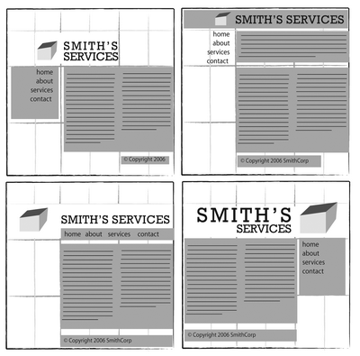 Figure 1.8: Four layouts in grids that follow the rule of thirds
As you experiment with different arrangements, use the lines that create the three main columns as alignment guides for the identity, navigation, content, and footer blocks. It’s very tempting to arrange all your elements along one particular line, but try not to let this happen–it’s not very interesting visually. Instead, consider pushing part of the block over that line, as I did with the identity block in the examples in Figure 1.8.
Another tendency for non-designers working on layouts is to center-align everything on a page. The grid system prevents us from doing that, but there is a reason why we tend to want to center everything. That reason is a desire for balance.
Figure 1.8: Four layouts in grids that follow the rule of thirds
As you experiment with different arrangements, use the lines that create the three main columns as alignment guides for the identity, navigation, content, and footer blocks. It’s very tempting to arrange all your elements along one particular line, but try not to let this happen–it’s not very interesting visually. Instead, consider pushing part of the block over that line, as I did with the identity block in the examples in Figure 1.8.
Another tendency for non-designers working on layouts is to center-align everything on a page. The grid system prevents us from doing that, but there is a reason why we tend to want to center everything. That reason is a desire for balance.
Balance
In a figurative sense, the concept of visual balance is similar to that of physical balance illustrated by a seesaw. Just as physical objects have weight, so do the elements of a layout. If the elements on either side of a layout are of equal weight, they balance one another. There are two main forms of visual balance: symmetrical and asymmetrical. Symmetrical Balance Symmetrical balance, or formal balance, occurs when the elements of a composition are the same on either side of an axis line. The digital painting Contemplation by David Lanham, shown in Figure 1.9, is a great example of this concept. Notice how the male and female figures in this painting are almost the same in position and proportion. Even the shaded background boxes are mirror images of one another.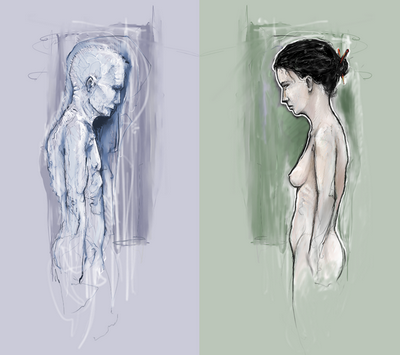 Figure 1.9: Symmetrical balance–Contemplation by David Lanham
Although it may not be practical for all designs and clients, this type of symmetry–called horizontal symmetry–can be applied to web site layouts by centering content or balancing it between columns. The Grow Collective web site is an example of such symmetry. Notice on the page shown in Figure 1.10 that the content areas graduate from a single column at the very top of the page, to two columns, to three columns at the bottom of the window; yet the layout still maintains its symmetrical balance. Most of the rest of the site’s content is divided into symmetrical columns as well.
Figure 1.9: Symmetrical balance–Contemplation by David Lanham
Although it may not be practical for all designs and clients, this type of symmetry–called horizontal symmetry–can be applied to web site layouts by centering content or balancing it between columns. The Grow Collective web site is an example of such symmetry. Notice on the page shown in Figure 1.10 that the content areas graduate from a single column at the very top of the page, to two columns, to three columns at the bottom of the window; yet the layout still maintains its symmetrical balance. Most of the rest of the site’s content is divided into symmetrical columns as well.
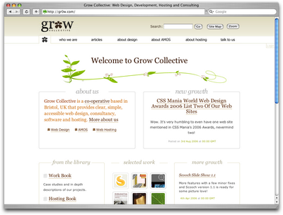 Figure 1.10: Grow Collective web page
The two other forms of symmetrical balance are less common in web site design, due to the nature of the medium. However, they’re commonly exhibited in logo and print design. These are:
Figure 1.10: Grow Collective web page
The two other forms of symmetrical balance are less common in web site design, due to the nature of the medium. However, they’re commonly exhibited in logo and print design. These are:
- bilateral symmetry, which exists when a composition is balanced on more than one axis
- radial symmetry, which occurs when elements are equally spaced around a central point
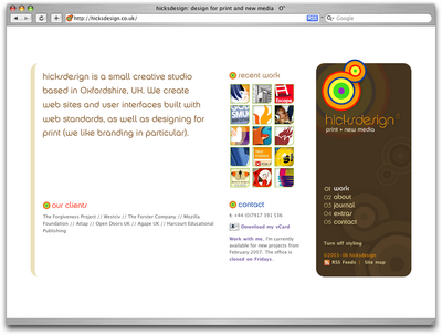 Figure 1.13: Hicksdesign–an example of asymmetrical balance
Many principles are at work in the design of John Hicks’s site–this design isn’t just about asymmetrical balance. The site has great harmony, which comes from the repeated, brightly colored bullets, similarly colored headers, and consistent typefaces. Part of that harmony arises from the fact that the site meets the principles of unity.
Figure 1.13: Hicksdesign–an example of asymmetrical balance
Many principles are at work in the design of John Hicks’s site–this design isn’t just about asymmetrical balance. The site has great harmony, which comes from the repeated, brightly colored bullets, similarly colored headers, and consistent typefaces. Part of that harmony arises from the fact that the site meets the principles of unity.
Unity
Design theory describes unity as referring to the way in which the different elements of a composition interact with one another. A unified layout is one that works as a whole rather than being identified as separate pieces. Take the monkeys in Figure 1.14, for example. Their similar colors and shapes mean that they can easily be recognized as forming a group, rather than merely being four monkeys. Although it’s not such an issue these days, unity is one of the many reasons why web designers have always despised HTML frames. It’s important that unity exists not only within each element of a web page, but across the entire web page–the page itself must work as a unit. We can use a couple of approaches to achieve unity in a layout (aside from avoiding frames): proximity and repetition. Proximity Proximity is an obvious, but often overlooked way to make a group of objects feel like a single unit. Placing objects close together within a layout creates a focal point toward which the eye will gravitate. Take a look at the digital painting in Figure 1.15. While composed of a seemingly random assortment of strokes, the five strokes that are the closest together appear to form a unified object. Figure 1.15: Creating a group using proximity
We practice the concept of proximity on the Web when we start setting margins and padding for elements. For instance, when I define the CSS style rules for most sites, I usually change the default margin that exists between common HTML elements such as headings (h1, h2, h3 …), paragraphs, blockquotes, and even images. By altering these values, I can cause more or less space to appear between elements, thereby creating groups.
If you look at the two columns of text in Figure 1.16, you’ll notice that they look very similar. The only difference is in the placement of the headings. In the column on the left, the word “Unkgnome” is equi-distant from the top and bottom paragraphs. This results in a heading that looks more like a separator than a heading for the next paragraph. In the second column, the “Gnomenclature” heading is placed closer to the paragraph that follows it. In accordance with the rules of proximity, this heading appears to belong to that block of text.
Figure 1.15: Creating a group using proximity
We practice the concept of proximity on the Web when we start setting margins and padding for elements. For instance, when I define the CSS style rules for most sites, I usually change the default margin that exists between common HTML elements such as headings (h1, h2, h3 …), paragraphs, blockquotes, and even images. By altering these values, I can cause more or less space to appear between elements, thereby creating groups.
If you look at the two columns of text in Figure 1.16, you’ll notice that they look very similar. The only difference is in the placement of the headings. In the column on the left, the word “Unkgnome” is equi-distant from the top and bottom paragraphs. This results in a heading that looks more like a separator than a heading for the next paragraph. In the second column, the “Gnomenclature” heading is placed closer to the paragraph that follows it. In accordance with the rules of proximity, this heading appears to belong to that block of text.
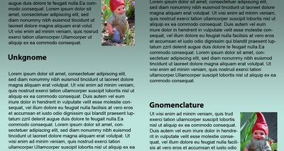 Figure 1.16: Proximity between headers and content
Repetition
A gaggle of geese, a school of fish, a pride of lions. Any time you bring a set of like items together, they form a group. In the same way, repetition of colors, shapes, textures, or similar objects helps to tie a web page design together so that it feels like a cohesive unit. The example in Figure 1.17 illustrates repetition. Even though there are other similar strokes around, the nine red strokes on the left-hand side appear to be a unified group because they repeat a shape, color, and texture. The strokes to the right of this group have no repeated pattern, so they appear isolated even though there are other shapes nearby.
Figure 1.16: Proximity between headers and content
Repetition
A gaggle of geese, a school of fish, a pride of lions. Any time you bring a set of like items together, they form a group. In the same way, repetition of colors, shapes, textures, or similar objects helps to tie a web page design together so that it feels like a cohesive unit. The example in Figure 1.17 illustrates repetition. Even though there are other similar strokes around, the nine red strokes on the left-hand side appear to be a unified group because they repeat a shape, color, and texture. The strokes to the right of this group have no repeated pattern, so they appear isolated even though there are other shapes nearby.
 Figure 1.17: Creating a group using repetition
Whether you notice it or not, repetition is often used in web site designs to unify elements of the layout. A good example of this concept at work among unmodified HTML elements is the bulleted list. The bullet that precedes each list item is a visual indicator that the bullet items are parts of a whole. Repeated patterns and textures can also help to unify a design. Take a look at the screenshot of Left Justified, the personal site of Australian designer Andrew Krespanis. This layout contains many eye-catching elements, but the repeated use of the red wood texture in the header, menu, and page borders literally hold this design together.
Figure 1.17: Creating a group using repetition
Whether you notice it or not, repetition is often used in web site designs to unify elements of the layout. A good example of this concept at work among unmodified HTML elements is the bulleted list. The bullet that precedes each list item is a visual indicator that the bullet items are parts of a whole. Repeated patterns and textures can also help to unify a design. Take a look at the screenshot of Left Justified, the personal site of Australian designer Andrew Krespanis. This layout contains many eye-catching elements, but the repeated use of the red wood texture in the header, menu, and page borders literally hold this design together.
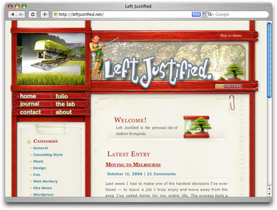 Figure 1.18: Left Justified homepage
Emphasis
Closely related to the idea of unity is the concept of emphasis or dominance. Rather than focusing on getting the various elements of a design to fit together, emphasis is about making a particular element draw the viewer’s attention. When you design a web page layout, often you’ll identify an item in the content, or the layout itself, that you want to stand out. Perhaps it’s a button you want users to press, or an error message that you want them to read. One method of achieving such emphasis is by making that element into a focal point. A focal point is anything on a page that draws the viewer’s eye, rather than just feeling like part of the page as a whole or blending in with its surroundings. As with unity, there are a few tried and true methods of achieving a focal point. Placement Although the constraints of practical web design do not often allow for it, the direct center of a composition is the point at which users look first, and is always the strongest location for producing emphasis. The further from the center an element is, the less likely it is to be noticed first; for an example of this, see Figure 1.19.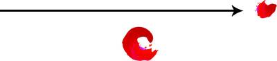 Figure 1.19: Continuance and placement–creating emphasis
Continuance
The idea behind continuance is that when our eyes start moving in one direction, they tend to continue along that path until a more dominant feature comes along. Figure 1.19 demonstrates this effect. Even though the bottom splotch is bigger and tends to catch your eye first, your brain can’t help but go “Hey, looky there, an arrow!” You’ll soon find yourself staring at the smaller object.
Continuance is also one of the most common methods that web designers use to unify a layout. By default, the left edge of headings, copy, and images placed on a web page form a vertical line down the left side of a page before any styling is applied. A simple way to expand on this concept is to use the rule of thirds to line up other page elements along the lines of your grid.
Isolation
In the same way that proximity helps us create unity in a design, isolation promotes emphasis. An item that stands out from its surroundings will tend to demand attention. Even though he’s sad to not be with his buddies on the other page, the isolated monkey in Figure 1.20 stands out as a focal point on the page.
Contrast
Contrast is defined as the juxtaposition of dissimilar graphic elements, and is the most common method used to create emphasis in a layout. The concept is simple: the greater the difference between a graphic element and its surroundings, the more that element will stand out. Contrast can be created using differences in color (which I’ll discuss in more detail in Chapter 2), size, and shape. Take a look at Figure 1.21.
Figure 1.19: Continuance and placement–creating emphasis
Continuance
The idea behind continuance is that when our eyes start moving in one direction, they tend to continue along that path until a more dominant feature comes along. Figure 1.19 demonstrates this effect. Even though the bottom splotch is bigger and tends to catch your eye first, your brain can’t help but go “Hey, looky there, an arrow!” You’ll soon find yourself staring at the smaller object.
Continuance is also one of the most common methods that web designers use to unify a layout. By default, the left edge of headings, copy, and images placed on a web page form a vertical line down the left side of a page before any styling is applied. A simple way to expand on this concept is to use the rule of thirds to line up other page elements along the lines of your grid.
Isolation
In the same way that proximity helps us create unity in a design, isolation promotes emphasis. An item that stands out from its surroundings will tend to demand attention. Even though he’s sad to not be with his buddies on the other page, the isolated monkey in Figure 1.20 stands out as a focal point on the page.
Contrast
Contrast is defined as the juxtaposition of dissimilar graphic elements, and is the most common method used to create emphasis in a layout. The concept is simple: the greater the difference between a graphic element and its surroundings, the more that element will stand out. Contrast can be created using differences in color (which I’ll discuss in more detail in Chapter 2), size, and shape. Take a look at Figure 1.21.
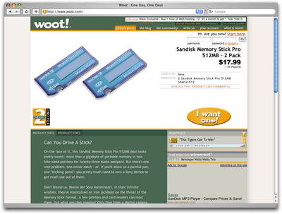 Figure 1.21: Woot–using orange for contrast
The site is Woot, an ecommerce web site that sells just one item per day. When you look at this layout, what’s the first thing that grabs your attention? My guess is it’s probably the product they’re selling. Products at Woot change daily, though, so what grabs your eye after that? For me, it’s the I want one! button. Although the same colors are used elsewhere in the design, the oval shape isn’t. When set against an area of white space, the button has both contrast and isolation working to emphasize it. The owners of Woot really want you to click that button.
Proportion
One interesting way of creating emphasis in a composition is through the use of proportion. Proportion is a principle of design that has to do with differences in the scale of objects. If we place an object in an environment that’s of larger or smaller scale than the object itself, that object will appear larger or smaller than it does in real life. This difference in proportion draws viewers’ attention to the object, as it seems out of place in that context.
In Figure 1.22, I’ve taken my monkey and superimposed him over the skyline of Manhattan to prove my point. Between the sharp contrast in color, and the difference in proportion, your brain immediately says, “Hey, something’s not right here,” and you’re left staring at the monkey until you force yourself to look away.
Figure 1.21: Woot–using orange for contrast
The site is Woot, an ecommerce web site that sells just one item per day. When you look at this layout, what’s the first thing that grabs your attention? My guess is it’s probably the product they’re selling. Products at Woot change daily, though, so what grabs your eye after that? For me, it’s the I want one! button. Although the same colors are used elsewhere in the design, the oval shape isn’t. When set against an area of white space, the button has both contrast and isolation working to emphasize it. The owners of Woot really want you to click that button.
Proportion
One interesting way of creating emphasis in a composition is through the use of proportion. Proportion is a principle of design that has to do with differences in the scale of objects. If we place an object in an environment that’s of larger or smaller scale than the object itself, that object will appear larger or smaller than it does in real life. This difference in proportion draws viewers’ attention to the object, as it seems out of place in that context.
In Figure 1.22, I’ve taken my monkey and superimposed him over the skyline of Manhattan to prove my point. Between the sharp contrast in color, and the difference in proportion, your brain immediately says, “Hey, something’s not right here,” and you’re left staring at the monkey until you force yourself to look away.
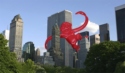 Figure 1.22: Proportion–a monkey in Manhattan
This principle works for miniaturization as well. If you take a look at my personal web site, Jasongraphix, pictured in Figure 1.23, one of the first things you might notice on the page is the mini-me leaning against my artwork just under the logo. As with the I want one! button on Woot, this little guy stands out because of contrast and isolation, but also because of the eye-catching use of proportion.
Figure 1.22: Proportion–a monkey in Manhattan
This principle works for miniaturization as well. If you take a look at my personal web site, Jasongraphix, pictured in Figure 1.23, one of the first things you might notice on the page is the mini-me leaning against my artwork just under the logo. As with the I want one! button on Woot, this little guy stands out because of contrast and isolation, but also because of the eye-catching use of proportion.
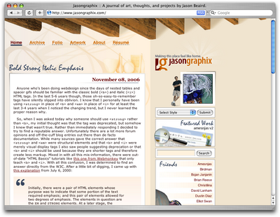 Figure 1.23: Jasongraphix–my personal site, featuring mini-me!
A few standard HTML tags and CSS properties have been designed to take advantage of the preceding theories to create emphasis in a web page even without customization. For isolation of content consider the blockquote element. This element indents the left- and right-hand side of any text placed within it, purposely breaking the continuation lines of the page content and drawing attention to itself. For positioning, consider the position property in CSS. By absolutely positioning an object with CSS, you take it out of the flow of its containing block, so you can place it strategically to draw attention. And when you think about contrast, think about the blink tag. Just kidding! Don’t ever think about the blink tag. Yes, it creates contrast … over and over and over again. Please don’t use it. Don’t get any ideas about using a marquee tag either. Design is just as much about what we leave out as it is about what we put in.
Next, we’ll look at some well-tested examples of designs from which you can work.
Figure 1.23: Jasongraphix–my personal site, featuring mini-me!
A few standard HTML tags and CSS properties have been designed to take advantage of the preceding theories to create emphasis in a web page even without customization. For isolation of content consider the blockquote element. This element indents the left- and right-hand side of any text placed within it, purposely breaking the continuation lines of the page content and drawing attention to itself. For positioning, consider the position property in CSS. By absolutely positioning an object with CSS, you take it out of the flow of its containing block, so you can place it strategically to draw attention. And when you think about contrast, think about the blink tag. Just kidding! Don’t ever think about the blink tag. Yes, it creates contrast … over and over and over again. Please don’t use it. Don’t get any ideas about using a marquee tag either. Design is just as much about what we leave out as it is about what we put in.
Next, we’ll look at some well-tested examples of designs from which you can work.
Bread-and-butter Layouts
Most of what we’ve talked about thus far has been design theory. Theory’s good, but it can only take us so far toward understanding why some ideas work–and others don’t–in a web site’s design. In my opinion, examples and practice are much more valuable. Most academic graphic design programs include a curriculum that’s rich in art history and fine art. These classes provide a great foundation for an understanding of graphic design from an art perspective, but they do little to prepare you for the specific challenges you encounter when you take your designs to the Web. Pablo Picasso once said, “I am always doing that which I can not do, in order that I may learn how to do it.” While I like to take that approach when designing a new web site, it’s important first to know what you can do. When you look out across the Internet, you can see that the possibilities for layout really are endless. But, as I said before, only a few of those possibilities make good design sense. That’s why we see certain configurations of identity, navigation, and content over and over again. In this section, we’ll talk about a few of the most common layouts, and explore some of their advantages and disadvantages. Left-column Navigation Regardless of whether we’re talking about liquid or fixed-width layout design, the left-column navigation format is the de facto standard. The ThinkGeek site, pictured in Figure 1.24, is a classic example of this configuration. Many sites that fit into this mold don’t necessarily use the left column as the main navigation block–sometimes you’ll see the navigation along the top of the page–but they still divide the layout below the header into a narrow (one-third or less) left column and a wide right column. It’s a status quo, like a security blanket, or that comfortable shirt with holes in the armpits that you wear once a week even though it drives your spouse crazy. For those reasons, a layout featuring left-column navigation is a safe choice for any project.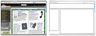 Figure 1.24: Left-column navigation at ThinkGeek
The downside to sites that use left-column navigation is that they can lack creativity. They’ve been done so many times, and in so many ways, that they tend to look the same. That’s not to say you shouldn’t use a left-column navigation layout. I’d guess that 75% of the sites I’ve designed have been based on the left-column navigation model, but I try to do something different when I can.
Speaking of different, how about picking that left column up and sticking it on the other side of the content? Then you’d have a right-column navigation layout.
Right-column Navigation
Although it’s difficult to find sites like Audi’s (depicted in Figure 1.25) that place the main site navigation along the right-hand side of the layout, it’s quite easy to find sites that use a right-hand column for sub-navigation, advertising, or sub-content. Since, in western cultures, our eyes scan from left to right, this allows the page’s main content to be the first thing viewers see.
Figure 1.24: Left-column navigation at ThinkGeek
The downside to sites that use left-column navigation is that they can lack creativity. They’ve been done so many times, and in so many ways, that they tend to look the same. That’s not to say you shouldn’t use a left-column navigation layout. I’d guess that 75% of the sites I’ve designed have been based on the left-column navigation model, but I try to do something different when I can.
Speaking of different, how about picking that left column up and sticking it on the other side of the content? Then you’d have a right-column navigation layout.
Right-column Navigation
Although it’s difficult to find sites like Audi’s (depicted in Figure 1.25) that place the main site navigation along the right-hand side of the layout, it’s quite easy to find sites that use a right-hand column for sub-navigation, advertising, or sub-content. Since, in western cultures, our eyes scan from left to right, this allows the page’s main content to be the first thing viewers see.
 Figure 1.25: Right-column navigation on Audi‘s web site
I’m not sure why there aren’t more sites that make use of the right column. The studies I’ve seen tend to swing both ways in regards to the usability and practicality of right-hand menus. In my own experience, my cursor tends to hover on the right side of the browser window anyway–so I can be closer to the scrollbar.
Ultimately, this is a judgement call that’s really about the needs of your clients and how they want people to perceive their online presence. Left-column navigation is familiar and more standard, but that’s not always the number one priority in designing a new site. One thing’s for sure, though: if you want your design to be different from the average web site, but you still want users to be able to find your navigation, you should give a right-column layout a try.
Three-column Navigation
The typical three-column layout has a wide center column flanked by two diminutive navigational columns. The Apple Store web site shown in Figure 1.26 is an example of this common web page layout staple. Although three columns may be necessary on pages that have a ton of navigation, short bits of content, or advertising to display, it’s important to remember that whitespace is essential if we are to keep a layout from appearing cluttered. Fortunately at the Apple Store, the three columns only exist on the homepage, and the center column has some whitespace that helps to promote eye movement.
Figure 1.25: Right-column navigation on Audi‘s web site
I’m not sure why there aren’t more sites that make use of the right column. The studies I’ve seen tend to swing both ways in regards to the usability and practicality of right-hand menus. In my own experience, my cursor tends to hover on the right side of the browser window anyway–so I can be closer to the scrollbar.
Ultimately, this is a judgement call that’s really about the needs of your clients and how they want people to perceive their online presence. Left-column navigation is familiar and more standard, but that’s not always the number one priority in designing a new site. One thing’s for sure, though: if you want your design to be different from the average web site, but you still want users to be able to find your navigation, you should give a right-column layout a try.
Three-column Navigation
The typical three-column layout has a wide center column flanked by two diminutive navigational columns. The Apple Store web site shown in Figure 1.26 is an example of this common web page layout staple. Although three columns may be necessary on pages that have a ton of navigation, short bits of content, or advertising to display, it’s important to remember that whitespace is essential if we are to keep a layout from appearing cluttered. Fortunately at the Apple Store, the three columns only exist on the homepage, and the center column has some whitespace that helps to promote eye movement.
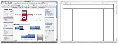 Figure 1.26: Three-column navigation at Apple Store
Getting Inspired
Just because the left-, right-, and three-column layout configurations are the bread and butter of most web page designs doesn’t mean you have to be confined to these layouts. A plethora–yes, a plethora–of design showcase and gallery sites have been created to feature new and innovative ideas that might help you think outside the box, including the following (just to name a few):- CSS Zen Garden at http://www.csszengarden.com/ — This site is the original showcase of fresh ideas for CSS. Even if you don’t intend to design a CSS Zen Garden template, it’s a great source of inspiration.
- CSS Beauty at http://www.cssbeauty.com/ — CSS Beauty is both a gallery of well-designed CSS web sites and a portal to the CSS design community.
- Stylegala Gallery at http://www.stylegala.com/archive/ — Stylegala is a great source of information about web design and standards, but the gallery features only the best-of-the-best new CSS designs.
- CSS Vault at http://cssvault.com/ — The CSS Vault’s gallery archive goes back to November 2003, so it’s not only a great source of inspiration, but a historical repository of great CSS design.
- Design Interact Site of the Week at http://www.designinteract.com/sow/ — Just for good measure, here’s one gallery that doesn’t concentrate on CSS-based designs. Design Interact is the multimedia- and technology-focused spin-off of Communication Arts, a leading trade journal for visual communication and graphic design. Design Interact has been highlighting (and archiving) a new and unique web site every week since January 1998.
Fresh Trends
If you’re feeling so overwhelmed by the above resources that you can’t even contemplate starting a morgue file for inspiration, just take a few minutes to browse through those sites. Look past the colors and textures to the boxes that make up the layout, and try to identify common ideas and design trends. By doing this, I’ve started to notice a few trends that seem to be emerging in web site layouts. Expansive Footer Navigation If you scroll to the bottoms of pages on many of the most recently redesigned sites, you’re likely to see an interesting new trend. Rather than using the footer for main links and a copyright notice, many sites are expanding this neglected piece of page real estate to include contact information, expanded site navigation, and extra content such as blogrolls, linkrolls, Flickr badges, and so on. Although putting a site’s main navigational element at the bottom of the page isn’t a good idea, the concept of including “bonus” navigation and content in that space has taken off lately. As Figure 1.27 shows, JeffCroft.com is just one of the sites trying this approach.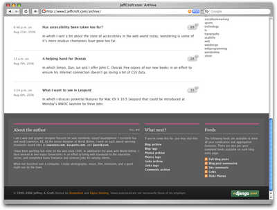 Figure 1.27: Presenting extra content in the footer at JeffCroft.com
See also:
Figure 1.27: Presenting extra content in the footer at JeffCroft.com
See also:
- City Church, at http://www.thecity.org/
- Powazek, at http://www.powazek.com/
- Fresh Branding, at http://www.freshbranding.co.uk/
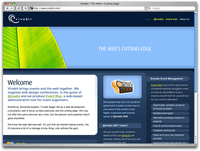 Figure 1.28: Putting content first at Vivabit.com
Although this isn’t really a new idea, it’s been picking up a lot of steam lately in both liquid- and fixed-width site designs. The majority of three-column layouts usually switch to a two-column structure outside the homepage. By placing the content on the left, the transition from three columns to two is more natural, as the content column can simply expand, rather than having to relocate completely. For example, if you visit any of the other main pages of the Vivabit site, the width of the content area seems simply to expand up and to the right when you navigate from the homepage into the site.
See also:
Figure 1.28: Putting content first at Vivabit.com
Although this isn’t really a new idea, it’s been picking up a lot of steam lately in both liquid- and fixed-width site designs. The majority of three-column layouts usually switch to a two-column structure outside the homepage. By placing the content on the left, the transition from three columns to two is more natural, as the content column can simply expand, rather than having to relocate completely. For example, if you visit any of the other main pages of the Vivabit site, the width of the content area seems simply to expand up and to the right when you navigate from the homepage into the site.
See also:
- Veerle’s Blog, at http://veerle.duoh.com/
- Django, at http://www.djangoproject.com/
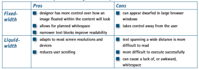 Table 1.1: Fixed- vs. liquid-width layouts–the pros and cons
With these pros and cons in mind, I’ve designed more fixed-width layouts than liquid. I like having control over how the content will display, and working with the background space. On the flip side, I sometimes enjoy the challenges that liquid layouts bring to the table. But, regardless of personal preferences, it’s important to put the needs of your client first. If you’re deciding on the width of a fixed-width layout, you have to think about the audience for which you’re designing, and create a layout that meets the needs of those users.
An Alternative: Variable Fixed-width Layout
The somewhat ironic term variable fixed-width layout was coined by Richard Rutter in an article that he wrote to catalog his findings about this new trend. It’s an excellent discussion of the topic that provides some great examples.
The homepage of Simon Collison’s Colly Logic exhibits the best implementation I’ve seen of this new trend. When you expand your browser window from 800 pixels to 1024 pixels in width, the right-hand column splits into a third column. Figure 1.29 shows how it works.
Table 1.1: Fixed- vs. liquid-width layouts–the pros and cons
With these pros and cons in mind, I’ve designed more fixed-width layouts than liquid. I like having control over how the content will display, and working with the background space. On the flip side, I sometimes enjoy the challenges that liquid layouts bring to the table. But, regardless of personal preferences, it’s important to put the needs of your client first. If you’re deciding on the width of a fixed-width layout, you have to think about the audience for which you’re designing, and create a layout that meets the needs of those users.
An Alternative: Variable Fixed-width Layout
The somewhat ironic term variable fixed-width layout was coined by Richard Rutter in an article that he wrote to catalog his findings about this new trend. It’s an excellent discussion of the topic that provides some great examples.
The homepage of Simon Collison’s Colly Logic exhibits the best implementation I’ve seen of this new trend. When you expand your browser window from 800 pixels to 1024 pixels in width, the right-hand column splits into a third column. Figure 1.29 shows how it works.
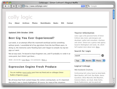 Figure 1.29: Viewing Colly Logic at 800 and 1024 pixel widths
Colly Logic acts as an intermediary between fixed- and liquid-width design. A handful of designers have been toying with this idea; CSS Beauty, one of the CSS gallery sites I mentioned earlier, takes a variable fixed-width approach to displaying features and advertising content.
Figure 1.29: Viewing Colly Logic at 800 and 1024 pixel widths
Colly Logic acts as an intermediary between fixed- and liquid-width design. A handful of designers have been toying with this idea; CSS Beauty, one of the CSS gallery sites I mentioned earlier, takes a variable fixed-width approach to displaying features and advertising content.
Screen Resolution
In comparison to the fixed-versus-liquid debate, the arguments about designing for particular screen resolutions are much more tame. When designers say that a site is designed, or optimized, for a particular screen resolution, they’re actually talking about the resolution of the viewer’s monitor. The debate has centered around whether or not we should design sites in such a way that people using a monitor resolution of 800×600 pixels could see the entire width of the content area with their browsers in full-screen mode. Given that we must account for sidebars and browser borders, this approach would see us design a content area that’s approximately (or that could be resized to approximately) 750 pixels wide. As of July, 2006, W3Schools’ screen resolution statistics showed that the number of W3Schools users who set their screen resolutions to 800×600 pixels had dropped, but not to the point that it could be safely ignored–see Figure 1.30. At the time, this resolution still accounted for 17% of users, but that number had dropped by 3-5% every six months for the previous two years. Does this mean that as soon as those displays set to 800×600 have been replaced, we can all start to design sites that are 1024 pixels wide? Hardly. Even if everyone was using a resolution of 1024×768 pixels or more, not everyone will use your site with the browser window maximized.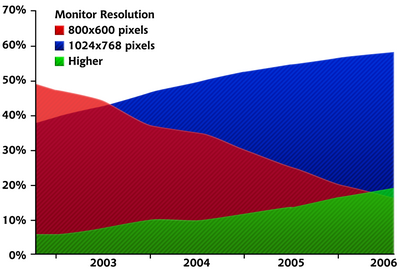 Figure 1.30: W3Schools’ screen resolution statistics
Although statistics like those provided by W3Schools help to give us reason to design for higher resolutions, the most important factor in web design is the end user. If the web site you’re building is for web professionals and people who are likely to use the latest computer equipment and high resolutions, it may be safe to push the design envelope and create designs that are wider than 800 pixels. The goal, though, is to prevent users from needing to scroll from left to right in order to read content. So, even if you decide to design beyond the 800-pixel standard, do not alienate the few 800×600 users you have by forcing them constantly to scroll from left to right and back again just to read your site’s content. You’ll only make them sea-sick!
The August 2005 redesign of design web site A List Apart provides a great example of how a design that’s wider than 800 pixels can remain accessible to users with 800×600-pixel displays. Even though a horizontal scrollbar displays on the site at an 800×600 resolution, you can see all of the real content without scrolling. At 1024×768 pixels, the horizontal scrollbar disappears, and another column becomes visible on the right, displaying search functionality, topic links, and advertising. This extra column adds functionality and structure to the design of the site, but doesn’t always need to be visible.
Figure 1.30: W3Schools’ screen resolution statistics
Although statistics like those provided by W3Schools help to give us reason to design for higher resolutions, the most important factor in web design is the end user. If the web site you’re building is for web professionals and people who are likely to use the latest computer equipment and high resolutions, it may be safe to push the design envelope and create designs that are wider than 800 pixels. The goal, though, is to prevent users from needing to scroll from left to right in order to read content. So, even if you decide to design beyond the 800-pixel standard, do not alienate the few 800×600 users you have by forcing them constantly to scroll from left to right and back again just to read your site’s content. You’ll only make them sea-sick!
The August 2005 redesign of design web site A List Apart provides a great example of how a design that’s wider than 800 pixels can remain accessible to users with 800×600-pixel displays. Even though a horizontal scrollbar displays on the site at an 800×600 resolution, you can see all of the real content without scrolling. At 1024×768 pixels, the horizontal scrollbar disappears, and another column becomes visible on the right, displaying search functionality, topic links, and advertising. This extra column adds functionality and structure to the design of the site, but doesn’t always need to be visible.
Application: Florida Country Tile
As I explained briefly in the section called “The Design Process,” much of what I do when I design a new web site or print item is subconscious. I can usually tell you on a choice-by-choice basis why I made specific decisions, but it doesn’t come naturally to verbalize the procedures I follow. So, for me to explain how I applied graphic design principles to create a layout for a new web site, for example, is a little difficult unless I have an example to help me break the process into steps. Enter: Florida Country Tile, a real company and a real client. Florida Country Tile is a small, Florida-based tile and stone installation company whose owners have agreed to let me use the web site design project on which I worked with them as an example here. Currently, the company doesn’t have an online presence; the only real identity collateral it has is the logo you see on the business card in Figure 1.31.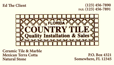 Figure 1.31: The business card of “Ed” from Florida Country Tile
I’ve altered the company contact information on the business card above, but that’s all–other than that, this card is identical to the cards the business uses. As you can tell, this scenario isn’t all that different from the one I introduced at the beginning of this chapter: the organization hasn’t established a very strong visual identity.
Usually, clients have specific ideas about what the site should look like. Depending on the client, these preconceptions can either help or hinder the design process–more often, the latter. However, on this project, I’ve been given free rein to make all design decisions, and I plan to design the site using the principles we’ll cover in each chapter of this book. Hopefully, “Ed the Client” will be happy with the results, and “You the Reader” will get a clearer picture of the design process I described so vaguely earlier in this chapter.
Getting Started
To start out, I arrange a meeting with the client to discuss his needs and desires for the web site. Unfortunately, I’m in South Carolina and Ed’s in Florida, so the meeting has to take place over the phone. Even though I already know this client very well and can answer many of my own questions about his business, I call him anyway. In contrast to the approach I use on most client projects, I’ll communicate with Ed about each component of the web site I’m building; I’ll do so toward the end of each chapter of this book. Since this chapter is all about layout, I have three key questions to ask him:
Figure 1.31: The business card of “Ed” from Florida Country Tile
I’ve altered the company contact information on the business card above, but that’s all–other than that, this card is identical to the cards the business uses. As you can tell, this scenario isn’t all that different from the one I introduced at the beginning of this chapter: the organization hasn’t established a very strong visual identity.
Usually, clients have specific ideas about what the site should look like. Depending on the client, these preconceptions can either help or hinder the design process–more often, the latter. However, on this project, I’ve been given free rein to make all design decisions, and I plan to design the site using the principles we’ll cover in each chapter of this book. Hopefully, “Ed the Client” will be happy with the results, and “You the Reader” will get a clearer picture of the design process I described so vaguely earlier in this chapter.
Getting Started
To start out, I arrange a meeting with the client to discuss his needs and desires for the web site. Unfortunately, I’m in South Carolina and Ed’s in Florida, so the meeting has to take place over the phone. Even though I already know this client very well and can answer many of my own questions about his business, I call him anyway. In contrast to the approach I use on most client projects, I’ll communicate with Ed about each component of the web site I’m building; I’ll do so toward the end of each chapter of this book. Since this chapter is all about layout, I have three key questions to ask him:
- How much content do you want to provide on the web site?
- What kinds of content do you want to provide on the web site?
- Is the logo on the business card used consistently across all collateral to brand your company?
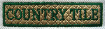 Figure 1.32: Embroidered Country Tile logo
Rather than sticking to my wide-ruled 79¢ spiral notebook, I pull a piece of blank paper out of my printer tray and draw out four 3×3 grids. I’m not sure exactly how I want to present the logo. That doesn’t matter at this point, though–I’m just trying to decide how to configure my blocks. After all that talk about how right-column layouts don’t get a lot of use, I’m thinking about having a multi-purpose sidebar on the right-hand side of the display. I can see us using this area for content on some pages, for a gallery or featured item on the homepage, and possibly as a subnavigation section on the Services page. I can use the emphasis properties we talked about earlier to make the content section stand out, but I’ll keep in mind our discussion of unity to make sure that this sub-column fits into the overall page design.
To continue readingThe Principles of Beautiful Web Design,visit Learnable and view the first chapter for free!
Figure 1.32: Embroidered Country Tile logo
Rather than sticking to my wide-ruled 79¢ spiral notebook, I pull a piece of blank paper out of my printer tray and draw out four 3×3 grids. I’m not sure exactly how I want to present the logo. That doesn’t matter at this point, though–I’m just trying to decide how to configure my blocks. After all that talk about how right-column layouts don’t get a lot of use, I’m thinking about having a multi-purpose sidebar on the right-hand side of the display. I can see us using this area for content on some pages, for a gallery or featured item on the homepage, and possibly as a subnavigation section on the Services page. I can use the emphasis properties we talked about earlier to make the content section stand out, but I’ll keep in mind our discussion of unity to make sure that this sub-column fits into the overall page design.
To continue readingThe Principles of Beautiful Web Design,visit Learnable and view the first chapter for free!
Frequently Asked Questions on Principles of Beautiful Web Design
What are the basic principles of beautiful web design?
The basic principles of beautiful web design include balance, contrast, emphasis, consistency, and unity. Balance refers to the distribution of elements, creating a visual equilibrium. Contrast can be achieved through varying size, color, and shape to draw attention to certain areas. Emphasis involves highlighting the important parts of a website. Consistency ensures a cohesive look and feel throughout the site, while unity is the relationship between the various parts of the website layout and the composition as a whole.
How can I apply these principles to my own website?
Applying these principles to your own website involves careful planning and design. Start by creating a balance in your layout, ensuring that no area is too heavy or light visually. Use contrast to make your key elements stand out. Emphasize the most important parts of your site, such as call-to-action buttons or key information. Maintain consistency in your design elements and ensure all parts of your site are unified in their design.
What role does color play in web design?
Color plays a significant role in web design. It can set the mood, evoke emotions, and even influence user behavior. A well-thought-out color palette can enhance user experience and drive conversions. It’s important to understand color theory and psychology when choosing colors for your website.
How important is typography in web design?
Typography is incredibly important in web design. It not only communicates information but also sets the tone for your website and can impact its usability. Choosing the right fonts, sizes, and spacing can significantly improve readability and user experience.
How can I ensure my website design is user-friendly?
To ensure your website design is user-friendly, focus on usability and accessibility. Make sure your site is easy to navigate with a clear, intuitive layout. Use readable fonts and colors, and ensure your site is accessible to all users, including those with disabilities.
What is responsive web design and why is it important?
Responsive web design is an approach that ensures your website looks and functions well on all devices, including desktops, laptops, tablets, and smartphones. With the increasing use of mobile devices for internet access, responsive design is crucial for reaching a wider audience and providing a consistent user experience.
How can I make my website visually appealing?
To make your website visually appealing, use high-quality images and graphics, choose a pleasing color palette, and ensure your typography is readable. Also, maintain a clean and uncluttered layout, use white space effectively, and ensure your design elements are consistent throughout your site.
What is the role of white space in web design?
White space, also known as negative space, plays a crucial role in web design. It helps to break up the layout and improve readability. It also allows the elements in your design to breathe, creating a more balanced and harmonious layout.
How can I keep my website design consistent?
Keeping your website design consistent involves maintaining the same look and feel throughout your site. This includes consistent use of colors, fonts, graphics, and layout styles. A style guide can be a useful tool to ensure consistency in your design.
How can I improve the loading speed of my website?
Improving the loading speed of your website can be achieved by optimizing your images, minimizing the use of heavy scripts and plugins, using a content delivery network (CDN), and implementing caching. Faster loading speeds can improve user experience and SEO rankings.
 Jason Beaird
Jason Beaird is a designer and front-end developer with over ten years of experience working on a wide range of award-winning web projects. With a background in graphic design and a passion for web standards, he’s always looking for accessible ways to make the Web a more beautiful place. When he’s not pushing pixels in Photoshop or tinkering with markup, Jason loves sharing his passion for the Web with others.