Super easy Atomic Design documentation with Sketch app
A quick look at how Nordnet designers submit work to our UI Kit, and a simple way to document the process.
The Nordnet design team are huge fans of Atomic Design. We use it to create and organise our UI Kit, used daily by our designers and marketing department to create consistent content and products. Fast.
As our UI Kit evolves, we’re constantly trying to develop our workflow and process too. Since we last looked at the Nordnet UI Kit on Medium, the layout and structure have seen a complete redesign. Every Atom, Molecule, Template, or Page (collectively I’ll call them components) is now well documented and organised.
More designers than ever now help contribute, so we need a robust way to submit ideas, discuss them, and then document and add new components to the UI Kit. We now use a template for each component inside Sketch to record the designer, date, component name and a brief description. Along with any notes on use or context that may be useful for others when using a component in their projects.
Our current process;
- Submit a design to the UI Kit folder on Dropbox.
- Discuss the inclusion of the design as a team.
- Document any included designs inside the UI kit. Add the new design to our Craft Library which will automatically roll out to the entire team.
1. Submissions
Any member of the team can submit ideas to the UI Kit, which are reviewed in a bi-weekly meeting before being included in our library.
Submissions are made by a designer saving a Sketch file containing their design into a “Submissions” folder on our Dropbox. The name of the file should be “ComponentName_YourName_Date.sketch” —
for example “Search_Ross_22Aug.sketch”.


The submission is also documented on a Trello board. Once a submission is in the backlog we will discuss it during our next weekly meeting and either approve it for inclusion or archive it.
2. Discussions
Not every piece of design needs to be in the UI Kit. Every other Monday we meet as a team and discuss any new submissions. We run through the Trello backlog. Cards are then moved from the backlog into “Approved for inclusion” or, if they don’t make the cut, are archived.

Once a design has been added to the Library we’ll give it a last review and make sure we’re happy with the documentation before releasing the update and moving it to “Done”.
3. Documentation
In order to simply and effectively document our UI components I have created a “Submission Template” Symbol in Sketch.
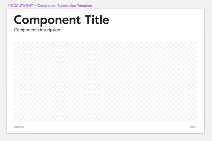
I set the symbol up so the checkerboard area is scalable. Allowing for a tonne of flexibility when showcasing designs.
Layout
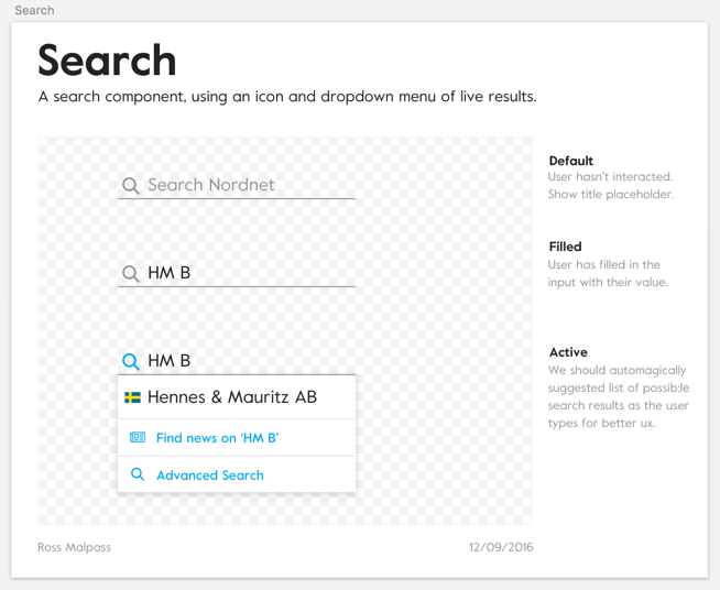
Each component is displayed on its own Artboard. In the example above, we looked at Search. Every different state of the Search component is shown inside the checkerboard area. Other contextual notes are made on the right hand side, and we document everything else in the header and footer.
All Artboards are stacked and I’ve allowed them to vary in width and height. It’s easy to make additions or re-organise Artboards and components this way. It’s also easy to scan.
It’s a super-simple process. Most importantly it’s collaborative. Even a designer who doesn’t own a component feels involved in the creation of our UI Kit. And when paired with the other workflows and toolkit we’ve written about, Nordnet is creating a powerful system for the Design and Marketing teams to create high quality designs extremely quickly.
Read more about our Atomic journey at Nordnet;
1. An Atomic workflow for design & development at Nordnet
2. A Craft-y way to automagically keep your design team in sync
3. A closer look at our Atomic workflow in action
Cheers
The Nordnet Design Studio
